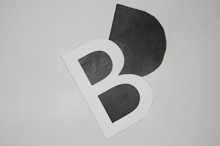
This workshop involved cutting and pasting your initials in different ways making them join and overlap or not join at all.
With the above logo I was thinking about the positive and negative space and the contrast with the white text on a black background.
I really like the idea of only using the inside of the letters. It also kind of looks like a smiley face :D
Here I was looking at the space that was left when the letter was cut out.
Making the inside of the letters a focus again.
This reminds me of building blocks as the letters are all leaning on each other for support.


No comments:
Post a Comment